Your cookie banner can be a trust asset for your company
If you're the one designing a cookie banner, the temptation to drop in a big button that says Accept all is HUGE. It's worth resisting: that little box is the first thing your organization tells each person about how it handles their data. And the evidence is clear: when rejecting is as easy as accepting, rejection goes up, but so does satisfaction with the decision and the sense of fairness compared with banners that push you into something you don't want. Half of all people admit they accept out of habit, not because they want to; that "yes" is not a preference, it's fatigue, and it's fragile when what you want is a memorable experience and a relationship built on trust. In this article we go through the practical evidence on what to avoid and what to encourage in your cookie banner.
One non-negotiable: don't use dark patterns
A "dark pattern" (or deceptive design pattern) is any interface trick that pushes a person to decide against their own interest: hiding the reject button, pre-ticking boxes, coloring "accept" bright green and "reject" gray, or flat out making people slip up to get the click. They work to lift a number in the short term. But they don't hold up over the long term, and the evidence shows it.
Evidence 1: the acceptance they produce can be challenged
The most cited study on the subject, by Nouwens and colleagues (CHI 2020), analyzed the banners on the most visited sites in the United Kingdom and found that only 11.8% met the minimum requirements of European law (1). The rest used, in one way or another, patterns that pushed people to accept. That remaining 88% is, in practice, piling up legally fragile consents: they can be challenged on whether they are "freely given" and "unambiguous".
Evidence 2: they don't reflect what people want
An online experiment run in France with nearly 4,000 participants compared different banner designs (2):
With a "neutral" banner, only 17% rejected cookies… far below the ~31% who said they would rather reject when asked directly.
A banner with no reject option sank rejection to 4%.
When the reject option was just as visible as the accept one, rejection climbed to 34%.
And the number that sums it all up: half of the participants admitted they accepted out of habit, not because they wanted to (2).
In other words: dark patterns don't "convince" anyone. They only exploit fatigue and inertia. The acceptance they generate is a mirage that doesn't represent a real decision by the data subject.
Evidence 3: they raise acceptance, but destroy trust
In that same French experiment, transparent, compliant banners were perceived as fair roughly twice as often as manipulative ones (2). People notice when they're being pushed. A trick that lifts conversion today can cost you the relationship and the reputation tomorrow.
And this isn't a problem with a handful of sites: an international study of 254,148 sites in 31 countries found that only 15% met the minimum requirements, and more than half installed cookies before the person chose anything (4). The "market standard" is, for the most part, illegal. It is not an example to copy.
Why is transparency worth it?
If the tricks don't work, does the honest alternative doom the business? No. The evidence suggests the opposite: transparency doesn't cost you valid acceptance, it builds it.
Transparency creates the only acceptance that counts
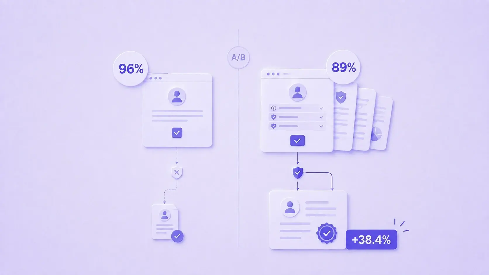
Let's go back to the key difference: there is induced acceptance (high, but invalid and fragile) and informed acceptance (the kind that comes from someone who understood and decided). Only the second is valid under the law, stable over time and paired with trust. The French experiment showed that when the design is transparent, rejection goes up… but so does satisfaction with your own decision: the share of satisfied people rose about 10 points when the reject/customize option was easy to find (2). People value being able to genuinely choose.
Transparency is a trust differentiator
That transparent banners are seen as fair twice as often (2) is not a detail: trust is the scarcest asset in a data-intensive economy. In a world where 82% of the global population is already covered by some privacy law (3) and people are saturated with notices, the organization that communicates clearly and transparently stands out. Privacy done well stops being a compliance cost and becomes a competitive advantage.
Transparency is what the law requires… and what the market is starting to reward
Honesty in consent isn't just "the right thing to do": it's what Law 21.719 requires (clear, prior and specific information) and what lowers your exposure to penalties. Lining up the legal, the ethical and the commercial in a single design decision is probably the best return on investment available on this topic.
A well-built banner doesn't cost you valid acceptance: it's the only way to get it. It lowers risk, improves the relationship with your users and sets you apart in a market where almost everyone is still copying the wrong standard.
The hard part is also keeping it up over time: making sure the consent record is complete and auditable, that purposes stay current when the product changes, and that you can show what each person accepted and when. That is exactly what we solve at Soyio. If you're leading this implementation, let's talk before the banner goes live: it's much cheaper to get it right the first time.
References
(1) Nouwens, M., Liccardi, I., Veale, M., Karger, D. & Kagal, L. (2020). Dark Patterns after the GDPR: Scraping Consent Pop-ups and Demonstrating their Influence. CHI '20, ACM.
(2) Bielova, N. et al. (2024). The Effect of Design Patterns on (Present and Future) Cookie Consent Decisions. USENIX Security. Online experiment with ~3,947 participants in France.
(3) IAPP: as of early 2025, close to 82% of the world's population was covered by some national privacy legislation (iapp.org).
(4) Compilation of large-scale web measurement studies on cookie banner non-compliance (254,148 sites in 31 countries; 35,000 European sites) and trust perception. Ignite.